

Easymove PH
The Easymove PH branding follows a simple promise from this Philippine moving service: making moving easier.
INDUSTRY
Logistics
OUR ROLE
Branding & UI Design
TIMELINE
2021
THE CHALLENGE
Easymove PH needed a brand and an app interface that lived up to its name. Every touchpoint, from logo to screen, had to make moving feel easier.
OUTCOME
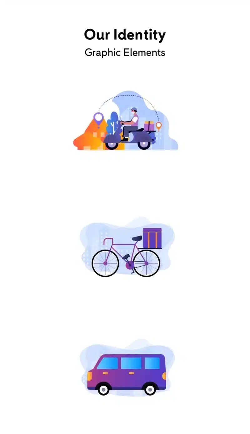
A brand identity with a logo system and illustrations, plus front-end UI design for the Easymove PH app.

Illustration, App and Social
Custom vehicle illustrations carry the brand into the booking app, where users choose a vehicle and book a delivery, and into social posts recruiting local driver partners.


Easymove PH Branding, Imagined
The mark appears on business cards and letterhead, then on driver caps, polos, and insulated delivery bags, keeping the brand consistent from office to street.


